Cloud seeding: Making rain in desert by a naturalised process

It’s tempting to call them rainmakers, the people who whoosh up into the skies, inject salts into fluffy clouds and fly back down to the ground. Except they’re not rainmakers.

In 2014, there were 193 flights that carried out ‘rain enhancing operations’. And so far in 2015, there have been 20 flights — all out of the Abu Dhabi-Al Ain region.

Cloud seeding in the UAE began in the 1990s. Back then these operations were done at random and it was only in 2001 when some scientific studies began on the subject.

The National Centre for Metrology and Seismology (NCMS) in 2004 started implementing solo projects, as NCMS puts it, “with our own facilities”.

Cost of these operations? They won’t say. But if there’s one thing Ali Al Musallam, Head of the Cloud Seeding Operations Section at NCMS, does empahsise, it is this: “We do not cause rain, we simply enhance it.”

One of the six cloudseed pilots for the six aircrafts deployed for this purpose, Mike — Michael Anstis — says, of the most repetitive, frequent questions people ask is: “Do you really make it rain”?

No. Nobody makes it rain. They do though make it rain (more). Cloud seeding or rain enhancement is one kind of weather modification. (There other kinds: fog dispersal, decrease of lightning, hail suspension)

The other misconceptions that annoy Musallam are layman conspiracy theories. Cloud seeding has nothing to do with climate change, he says. “And no, dust storms are not caused when cloud seeding happens — those are simply variables in the weather”.

 Raindrops keep falling

One cloud contains up to 270 million gallons of water — without being seeded. When they are seeded successfully, there is a 30 per cent increase in rain — whenever it does rain. And that rain then creates water worth $300,000.  

That 30 per cent extra is when the air is free of pollutants, that is a ‘non-turbid atmosphere’. Haze is no good. Because when the air is turbid and polluted, there is a 10-15 per cent chance of success. There’s much cost-effectiveness to think about.

This keenness to increase rain, given the desert realities, cannot be underestimated. In early 2015, a $5 million dollar programme was launched by the Ministry of Presidential Affairs (MoPA) mainly to expand global water security. They’re looking for ways to “enhancing precipitation to increase rainfall in the UAE, as well as other arid and semi-arid areas in the region”.

 How it’s done?

Cloud seeding is done when a cocktail of potassium chloride and sodium chloride is injected in cumulus clouds. Once these are injected with salts, they further fluff up, become heavy and cause some bonus droplets. The principle is the same as when salt spills on your kitchen counter, and overnight it turns into beads of moisture.

According to Sufian Farrah, a senior forecaster at NCMS: “The success rate of cloud seeding, when done in turbid atmosphere, that is when there are pollutants in the air, is a mere 10-15 per cent. In non-turbid conditions, there is up to a 30 per cent increase in rain if clouds are successfully seeded”.

The ingredients of the flare

Potassium chloride and sodium chloride are best to attract moisture. Sometimes up to 7 per cent magnesium is added to the two aforementioned components to enable firing. “Magnesium, though, is not always added as then the composition changes and the molecules turn smaller in size,” says Farrah.

 Rough days at work for pilots

One danger of cloud seeding operations is that the pilots are sent up when the weather is rough, when the clouds are fat and bumpy. The turbulent conditions a commercial pilot would avoid are the very ones that a cloudseeding pilot embraces. Or as pilot Mike says: “We have to fly into the dangerous parts of the sky.”

Forests west of the Cascades will see more fires, bigger fires with climate change

BEACON ROCK STATE PARK, Skamania County — As night fell last Monday in the Columbia River Gorge, the Oregon slopes burned as if carpet-bombed from above. Winds acted like bellows in a hearth to supercharge the flames spread by embers flying from ridge to ridge. Stands of trees that matured over decades — sometimes centuries — were engulfed within minutes.

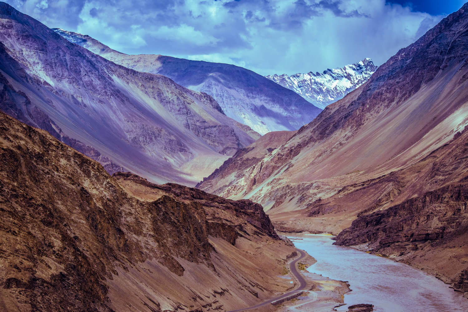
This Eagle Creek blaze is a dramatic reminder that the forests of Western Oregon and Washington, so often cloaked in snow or drenched by rain, have a cycle of fire and renewal. When conditions are right, they can burn in spectacular fashion just like the more arid landscapes east of the Cascades.

The fires are less frequent than in drier forests, but the burn cycles are not etched in stone. They reflect a climate that scientists forecast to undergo big changes in the decades ahead as global combustion of fossil fuels warms the Earth. In the Pacific Northwest, climate models indicate that average summer temperatures will warm later in this century by 4.7 degrees to 6.5 degrees compared with the last half of the 20th century.

This warming is likely to shorten the burn cycles in the Puget Sound region as well as other parts of Western Washington and Western Oregon.

Those risks likely will include more smoke hanging around Western Washington and Oregon, and more fire threats to west-side communities, where many homeowners have yet to consider removing close-by trees and brush to create defensible spaces should flames threaten their land.

This year, the smoke is the result of fires that have burned around the Pacific Northwest, including more than 732,000 acres in Washington and Oregon. Significant fires have flared west of the Cascades, including the Eagle Creek fire that has burned more than 32,000 acres, and threatened small communities outside of Portland. ADVERTISING

If the models analyzed by the University of Washington are accurate, this Pacific Northwest summer could be a mild preview for the kind of heat we are likely to routinely experience later in the century. The three months that ended in August ranked as the third-hottest Pacific Northwest summer on record. Yet, they fall on the low end of what is forecast in the last half of this century, according to Snover.

That additional heat would make the forests more vulnerable to fire. Two studies cited by the Climate Impacts Group estimate that the average acreage burned in a year west of the Cascades at the end of this century would be double the average burned during the last half of the 20th century.

Big fires in the past

Fire ecologists who study the history of our region note earlier periods of intense fire activity in the west-side forests.

The Olympic Peninsula, for example, had a series of mega-fires that burned more than 1 million acres during a 33-year period in the 1700s, according to research that looked at tree rings and fire scars.

More recently, the September 1902 Yacolt Burn raged across more than 230,000 acres, spreading largely through Western Washington forests north of the Columbia River Gorge. This was a fearsome fire even for residents from Seattle who were hit with what The Seattle Times reported as “great banks of smoke clouds” that drifted over the city, blotted out the sun and “floated through the streets of the city like an awful quiet harbinger of approaching doom.”

Sign up for Evening Brief

Delivered weeknights, this email newsletter gives you a quick recap of the day’s top stories and need-to-know news, as well as intriguing photos and topics to spark conversation as you wind down from your day.

Prolonged summer heat is a key ingredient for such big fire seasons, and the Climate Impacts Group forecasts that predict the 21st-century warming are based on an analysis of more than three dozen climate models with different projections.

Researchers then develop an average annual temperature based on a scenario that assumes aggressive efforts to reduce fossil-fuel emissions. They also include scenarios with the use of petroleum, coal and natural gas continuing roughly at current levels.

The models project that the summer heat will come with less rain, further drying out the forests.

This year a dry, hot August primed west-side forests to burn. Forest Service officials, since 1990, have estimated the moisture content of large dead trees on the ground. By the end of August, those estimates indicated they were potent fuel for fires, according to John Saltenberger, fire weather program manager for the Portland-based Northwest Interagency Coordination Center.

“All across the Northwest, they were either at — or exceeding — the lowest values on record, especially on the west side,” Saltenberger said.

Nature’s humbling display

Wildfires don’t happen without a source of ignition. People often provide that first flame, particularly in west-side forests where lightning is less common than east of the Cascades.

Oregon State Police say a 15-year-old boy from Vancouver, Washington, is suspected of starting the Sept. 2 fire in the Columbia River Gorge, but he has not been charged. He allegedly tossed a firework while on a trail along Eagle Creek, a steep side canyon near Bonneville Dam that included old-growth Douglas fir, cedar and other softwoods.

More than 150 hikers were trapped until Sunday, when they could be safely evacuated. The fire blew up Monday afternoon, as temperatures climbed past 90 degrees, humidity dropped and winds from the east roared through the Gorge with gusts as high as 55 mph.

In 16 hours, the fire marched some 12 miles to the west, moving through the heart of one of the most popular hiking areas in the Portland area. People gathered along the Washington side of the river for a ringside seat to an enthralling and humbling display of nature’s forces.

As trees ignited, fiery red avalanches of flames snaked along the Gorge’s steep flanks. Some embers flew north across the Columbia River to Washington, and set off a new fire near the town of Skamania.

“That fire made a historic run. It’s fire behavior we haven’t seen in this area for a long time,” said Jim Trammell, fire-defense chief for Hood River County in Oregon.

In recent days, there has been an outpouring of grief over what was lost, as well as anger at the act that touched off the fire.

As the weather eased, the fire — while far from contained — grew calmer.

During a media tour along the Oregon side of the Gorge, it was possible to take a closer look. You could see how the fire — despite its ferocity — burned unevenly. In some areas, once-green forests turned into patches of dead snags. Elsewhere, the flames laid low and crept along the forest floor.

Scientists remind us that such fires help to bring about new life, and remain an essential part of the forest ecology. Berry plants, for example, will flourish in newly opened areas and provide food for wildlife. Seedlings will emerge.

“Even in the areas of the most intense burn, it is not an end, but a beginning, when you understand the processes that are at work,” said Dominick DellaSala, chief scientist for the Geos Institute, of Ashland, Oregon, and co-author of a book that focuses on the ecological importance of forest fires.

Scientists still are uncertain just how the west-side forests will evolve in a century with more frequent fires.

Some studies predict forests will contain less wood, and thus store less carbon, according to the Climate Impacts Group. That’s largely due to the forecasts that more will burn, as well as greater impacts from disease and insects, according to Snover.

The mix of trees may change.

Some species, such as hemlock and cedar, have thin bark and readily succumb to fire. So they may find themselves in retreat. Other species, such as Douglas fir, have thicker bark and are far more resilient to fire and regenerate in direct sunlight. They are likely to fare better.

‘”I fully expect, with climate change, some shifts in vegetation to occur,” said Jane Kertis, a U.S. Forest Service scientist based in Corvallis, Oregon. “Fire is laying bare the conditions for that to begin.’’

China claims world’s biggest man-made waterfall

A province in southern China known for its stunning natural beauty can now also boast the world’s largest man-made waterfall – but it doesn’t come cheap.

Flowing 108 metres (350 feet) down the glass exterior of the Liebian International Building in Guiyang, capital of Guizhou province, the waterfall is about 3 metres longer than the previous record holder at the Solar City Tower in Rio de Janeiro, Brazil.Chinese tourists accused of pinching ‘crown jewels’ from Vladivostok’s glass beach

Built by Ludi Industry Group, the feature uses recycled water from basement storage tanks, which is pushed to the top of the 121-metre-high building by four giant pumps before re-emerging as a cascade from a massive opening on one side.

Once fully occupied, the multi-purpose building will comprise offices, shops and a luxury hotel, company director Cheng Xiaomao said, though the latter has to be completed.

The idea for the waterfall came from company president Zhou Songtao, who said he wanted to promote the city’s green image.SUBSCRIBE TO US China Trade WarGet updates direct to your inboxBy registering for these newsletters you agree to our T&C and Privacy Policy

“Guiyang is a city of mountains, and with many trees, just like a forest. He wanted to create a feeling of water and greenery, even when you are surrounded by skyscrapers,” Cheng said.From Africa to Europe, dragon boat races are spreading across the world

Although the waterfall was completed about two years ago, it has only been turned on six times, with the latest occasion being for half an hour on Sunday to mark the Guiyang International Marathon.

Nevertheless, people had already begun to consider the building a local landmark and were using it as a place to go for a walk or to socialise, Cheng said.

Once fully occupied, the multi-purpose building will comprise offices, shops and a luxury hotel. Photo: ImaginechinaShare:

One of the reasons the waterfall does not appear more often is the operating cost. While the water comes free, the price of powering the pumps is about 800 yuan (US$117) an hour, Cheng said.

While some internet users questioned whether the extravagant design was a waste of money, others were full of compliments.

“The scene is very impressive. You seldom see a waterfall in a city,” said a woman in a video published on the Pear Video website this week.

“It looks very soothing on a hot summer day. The idea is very creative,” said another.

One social media user was undecided, however.

“A price must be paid for an artificial spectacle, especially a large one like this. Whether it’s a waste of money or worth more than the 800 yuan an hour is for the company to calculate.”

North Coast Night Lights: Houda Beach Cave

The Milky Way rises from the horizon near the glow of the setting crescent moon outside of this hidden Houda Beach cave. Camel Rock’s silhouette is large on the horizon beside the glow of the setting crescent moon. Humboldt County, California. September 13, 2018.

It was a low tide, a low moon, the cave and the Milky Way — long had I waited for this combination to come together. And when it did, somehow, I was there. All summer I’d watched the tides, waiting for a tide low enough for me to get to the cave safely sometime before midnight (hey, I get tired). But the idea had slipped from the forefront for a time and I hadn’t been watching the tides when the bug to go out hit me and I called my brother Seth for company on a photographic outing.

Near the cave’s entrance, Mars peeks over the edge as two rocks frame the Milky Way.

Checking the tide, I saw that it would be fairly low right after the crescent moon set. I decided on Houda Beach, anticipating that some interesting rocks would be exposed. I hadn’t realized that the tide would be low enough to reach the cave until we arrived, but it was. Not only that, the Milky Way was lined up outside of it, framed in the entrance, along with the silhouette of Camel Rock near the setting moon. I’d wanted this photo for months but only when I forgot to plan it did it come about. It’s interesting how that works. And I realized then that even if low tides had allowed me nighttime access to the cave during the summer months, the Milky Way would have been out of view to the left. It had to be this night. And I was there. I’m grateful for these opportunities.

My brother and I watched the crescent moon set before taking the Milky Way photos. In gathering enough light to illuminate the interior and see the stars this well, the moon’s crescent shape became blown out in the highlights.

Leaving the cave, we were alerted by sirens behind us and turning found a large fire burning farther north up Scenic Drive, illuminating the entire area and throwing a great smoke plume across the waters. According to reports I read later, it was a vegetation fire. We watched the lights of first responders approaching it and it seemed to us by the diminished glow that they quickly had it under control.

At one point while photographing, my brother and I played with our light beams beneath the cosmos, careful not to cross the streams. We tried one take on this, and by luck our beams formed a little house over the setting moon and Camel Rock.

How to Paint a Wall?

Getting ready to paint a wall? Don’t skip the prep work: A properly primed surface makes all the difference. This video shows how to make both painting and priming a snap.

Getting ready to paint a wall? Don’t skip the prep work: A properly primed surface makes all the difference. This video shows how to make both painting and priming a snap.

What You Need

  • cellulose sponge, dishwashing liquid, painter’s tape, primer, paint, paint tray, paint roller, two-inch angled paintbrush, ladder

Follow These Steps

  1. Clean the walls
    Using a large cellulose sponge and a solution of water mixed with a few drops of mild dishwashing liquid, clean your walls to remove any dust, dirt, and grease.
  2. Tape the trim
    Use blue painter’s tape (not masking tape) to protect any areas you don’t want your paint to get on, such as trim, molding, doorknobs, window frames, and door frames: Run long strips of the tape just inside the outer edges of these areas. (The outer edges of the tape should lie exactly where the wall meets the trim, covering the parts of the trim that your roller or paintbrush might hit when you paint.)
  3. Pour primer into a tray
    Pour in enough so that it almost fills the well toward the bottom of the tray without covering the angled portion of the tray where the ridges are.
  4. Roll the primer onto the wall
    Dip your roller into the primer, rolling it back and forth across the tray’s ridges a few times to remove any excess and prevent drips. Make sure the roller gets evenly coated. Run the roller up and down a section of the wall, applying primer until the section is fully covered. Continue until your wall is fully covered, reapplying primer to the roller as needed.  
    Tip: Follow the manufacturer’s drying instructions, which you’ll find on the can, to make sure the primer is completely dry before applying paint.
  5. Paint the trim
    Dip a two-inch angled brush into the paint, coating the bristles only about a third of the way down the brush. Run the brush along the outer edge of the tape that’s covering the trim (on the wall side of the tape; not the trim side). Keep applying paint flush against your taped trim, working it outward about two or three inches from the tape. Continue until you have finished painting a narrow swathe along all of the taped areas.
  6. Roll on paint in a “w” shape
    Fill a paint tray with paint; dip your roller into it, removing excess. Roll the paint onto the wall in a 3-by-3-foot “w” shape. Working your way back across that “w,” without lifting the roller, fill in empty patches until that section of wall is fully covered. Continue, adding more paint to the roller as needed, until the whole wall is painted.
  7. Remove the painter’s tape
    Peel off the tape while the paint is still wet to avoid accidentally removing any dried paint along with it.

4 Ways to Improve Your Office’s Work Environment

Your work environment impacts your mood, drive and performance. If employees work in a dreary office setting with unfriendly workers, they likely won’t feel motivated or confident to speak up. That’s why creating a productive work environment is critical to the overall success of your company.

Here are four ways you can improve your work environment and, in turn, employee engagement.

1. Hire great team members (and don’t be afraid to let bad ones go)

Smart businesses know that a good work environment starts with hiring the right people. Make sure employees are professional and team players. The same idea translates to those who are already in the office. When employees work with toxic workers, they are more likely to become toxic themselves.

“It’s amazing to watch one bad attitude affect everyone’s daily performance,” said Claire Marshall Crowell, chief operating officer of A. Marshall Family Foods/Puckett’s Grocery & Restaurant. “I can’t tell you how many times I have been thanked after letting poisonous employees go. Though it’s a hard thing to do, it ultimately impacts the working environment, which can be felt by not only our employees but also by our [customers].”

2. Improve the lighting

Lighting plays a vital role in workers’ performance and attitude. An article by MBA@UNC, the University of North Carolina at Chapel Hill Kenan-Flagler’s online MBA program, states that exposure to natural light improves mood and energy, greatly impacting focus and productivity. But according to a survey by Pots Planters and More, nearly half of office workers said there is little to no natural light in their office.

If it’s not possible to incorporate natural lighting through windows, there are other options. Blue-enriched light bulbs may reduce fatigue and increase happiness and work performance, according to the article. Use this type of lighting in brainstorming rooms. In meeting or break rooms, use warmer tones to promote calmness and relaxation. In conference rooms, use middle tones that welcome workers while keeping them alert.

3. Make the office comfortable

Working in a clean, attractive office can have tremendous effects on co-workers and manager relationships, said Mike Canarelli, CEO and co-founder of Web Talent Marketing.

“Even if the sun can’t shine into your workplace, make an effort to provide a relaxing atmosphere with comfy furniture, working equipment and a few ‘extra-mile’ amenities,” he noted.

For example, give your employees the flexibility to choose to work where they’re comfortable, including comfy chairs or a choice of whether to sit or stand at their desks.

According to the Pots Planters & More survey, people who labeled their work furniture as “bad” are three times more likely to consider their environment as less productive, and two times more likely to find it “depressing.”

“Make it easy for [workers] to purchase things like exercise balls and plants on the company dime,” said AJ Shankar, CEO and founder of litigation software company Everlaw. “We also trust our employees to manage their own time. They’re free to take breaks to play games or just recharge as necessary.”

When employees choose a space that makes them comfortable, give them the freedom to customize their area, as everyone works differently, said Josh Turner, CEO of user feedback platform UsersThink. He suggested getting rid of the “same-issued everything” and giving everyone a budget to customize their own setup.

4. Improve communication

Be cognizant of how you’re interacting with employees. Team members and upper management should focus on their communication methods and the effects they have on the office environment.

“Employees are motivated and feel valued when they’re given positive reinforcement and shown how their work contributes to the success of the business,” said Dominique Jones, former chief people officer at Halogen Software.

This means offering employees specific feedback on how their work is feeding into the broader business objectives, she noted.

But employees shouldn’t be the only ones being evaluated. Managers should be open to feedback as well, said Samantha Lambert, director of human resources at Blue Fountain Media.

“When you involve your staff in decision-making in an effort to create a better work environment, they feel valued,” Lambert said. “Don’t be afraid to ask employees for their opinion on a new benefit offered, or what they think of a new client project.”

While you’re working on communication, don’t forget to show gratitude for hard work. According to David Sturt, executive vice president of marketing and business development at the O.C. Tanner Institute, effective employee recognition can transform and elevate an organization.

“It ignites enthusiasm, increases innovation, builds trust and drives bottom-line results,” he said. “Even a simple ‘thank you’ after an employee goes above and beyond on a project, or puts in a series of late nights, goes a long way.”

Airbnb’s Newest Host Is the ‘Mona Lisa,’ and the Louvre’s Letting Two Special Guests Spend a Night at Her Place

The museum is hosting a lucky pair of guests for one unforgettable night among the masterpieces to celebrate the 30th birthday of the Louvre Pyramid.

The Louvre and Airbnb are offering two lucky winners a private sleepover party at the Paris museum. An exclusive dinner, and drinks in front of the Mona Lisa are part of the extraordinary minibreak.

The once-in-a-lifetime offer is being given to a pair of guests who will get to spend the night of April 30 glamping in a pyramid-shaped bedroom beneath the real one at Paris’s most famous museum. Guests will dine beside the Venus de Milo as well get to enjoy the Mona Lisa, all without any other visitors pushing past for a better selfie angle. Airbnb and the Louvre’s partnership will continue with a series of events that are due to be revealed in the coming weeks.

The special offer is part of the Louvre’s celebrations of the 30th birthday of the pyramid entrance designed by the Chinese-American architect I. M. Pei. Though deemed an eyesore by many in Paris at the time, it quickly achieved iconic status.

After drinks and dinner, the itinerary includes time to wind-down in Napoleon III’s rococo salon before the guests retire to their sleeping quarters in a frosted glass miniature pyramid. The promotional video features a young woman in pajamas jogging alone through the museum, which is not exactly what the museum has in mind—guests will not have free reign over the museum, but they will be getting a personal tour by an art historian.

“We know that many people would love the opportunity to wander alone at night through the Louvre and we want this to be a magical and unforgettable experience,” says Anne-Laure Béatrix, the deputy managing director of the Musée du Louvre.

The Louvre has been stepping up its efforts to become more hip and happening. The street artist JR installed a massive trompe l’oeil tribute to the museum at the weekend. He unveiled the giant ephemeral collage on Saturday. The museum’s efforts to attract a wider audience seems to have worked especially well last year. It broke its attendance record in 2018, welcoming 10 million visitors. The record number was helped by some blockbuster shows, including a major Delacroix survey and Beyoncé and Jay-Z’s billboard-topping music video, “Apes**t”, which the couple filmed in the museum after hours.

The deadline to apply for the exclusive night at the Louvre Airbnb  ends on April 12 at 6 p.m. Eastern Standard Time. Nabbing the overnight stay will take more than luck. You need to write in 800 characters or less why you would be the Mona Lisa’s ideal guest.

9 Essential Principles for Good Web Design

Web design can be deceptively difficult, as it involves achieving a design that is both usable and pleasing, delivers information and builds brand, is technically sound and visually coherent.

Add to this the fact that many Web designers (myself included) are self-taught, that Web design is still novel enough to be only a side subject in many design institutions, and that the medium changes as frequently as the underlying technology does.

So today I’ve put together my 9 principles for good Web design. These are only my opinions and I’ve tried to link off to more reading on subjects so you don’t only hear my voice. Obviously, I have lots of disclaimers: rules are made to be broken, different types of design work differently, and I don’t always live up to my own advice. So please read these as they are intended–just some observations I am sharing…

Capture the Valley uses bars of color to guide your eye through sections from top to bottom…

1. Precedence (Guiding the Eye)

Good Web design, perhaps even more than other type of design, is about information. One of the biggest tools in your arsenal to do this is precedence. When navigating a good design, the user should be led around the screen by the designer. I call this precedence, and it’s about how much visual weight different parts of your design have.

A simple example of precedence is that in most sites, the first thing you see is the logo. This is often because it’s large and set at what has been shown in studies to be the first place people look (the top left). his is a good thing since you probably want a user to immediately know what site they are viewing.

But precedence should go much further. You should direct the user’s eyes through a sequence of steps. For example, you might want your user to go from logo/brand to a primary positioning statement, next to a punchy image (to give the site personality), then to the main body text, with navigation and a sidebar taking a secondary position in the sequence. 

What your user should be looking at is up to you, the Web designer, to figure out. 

To achieve precedence you have many tools at your disposal:

  • Position — Where something is on a page clearly influences in what order the user sees it.
  • Color — Using bold and subtle colors is a simple way to tell your user where to look.
  • Contrast — Being different makes things stand out, while being the same makes them secondary.
  • Size — Big takes precedence over little (unless everything is big, in which case little might stand out thanks to Contrast)
  • Design Elements — if there is a gigantic arrow pointing at something, guess where the user will look?

Further Reading:

You can read more of my thoughts on Precedence in an old Psdtuts+ post called Elements of Great Web Design – the polish. Joshua David McClurg-Genevese discusses principles of good web design and design at Digital-Web. Joshua also has the longest name ever 🙂

Marius has a very clean, very simple site with plenty of space

2. Spacing

When I first started designing I wanted to fill every available space up with stuff. Empty space seemed wasteful. In fact the opposite is true.

Spacing makes things clearer. In Web design there are three aspects of space that you should be considering:

  • Line Spacing
    When you lay text out, the space between the lines directly affects how readable it appears. Too little space makes it easy for your eye to spill over from one line to the next, too much space means that when you finish one line of text and go to the next your eye can get lost. So you need to find a happy medium. You can control line spacing in CSS with the ‘line-height’ selector. Generally I find the default value is usually too little spacing. Line Spacing is technically called leading (pronounced ledding), which derives from the process that printers used to use to separate lines of text in ye olde days — by placing bars of lead between the lines.
  • Padding
    Generally speaking text should never touch other elements. Images, for example, should not be touching text, neither should borders or tables.
    Padding is the space between elements and text. The simple rule here is that you should always have space there. There are exceptions of course, in particular if the text is some sort of heading/graphic or your name is David Carson 🙂 But as a general rule, putting space between text and the rest of the world makes it infinitely more readable and pleasant.
  • White Space
    First of all, white space doesn’t need to be white. The term simply refers to empty space on a page (or negative space as it’s sometimes called). White space is used to give balance, proportion and contrast to a page. A lot of white space tends to make things seem more elegant and upmarket, so for example if you go to an expensive architect site, you’ll almost always see a lot of space. If you want to learn to use whitespace effectively, go through a magazine and look at how adverts are laid out. Ads for big brands of watches and cars and the like tend to have a lot of empty space used as an element of design.

Further Reading:

At WebDesignFromScratch there is a great article called the Web 2.0 how-to design guide, which discusses Simplicity – a concept that makes a lot of use of spacing. There’s plenty of other useful stuff there too!

Noodlebox does a good job of using on/off states in their navigation to keep the user oriented.

Advertisement

3. Navigation

One of the most frustrating experiences you can have on a Web site is being unable to figure out where to go or where you are. I’d like to think that for most Web designers, navigation is a concept we’ve managed to master, but I still find some pretty bad examples out there. There are two aspects of navigation to keep in mind:

Navigation — Where can you go?
There are a few commonsense rules to remember here. Buttons to travel around a site should be easy to find – towards the top of the page and easy to identify. They should look like navigation buttons and be well described. The text of a button should be pretty clear as to where it’s taking you. Aside from the common sense, it’s also important to make navigation usable. For example, if you have a rollover sub-menu, ensuring a person can get to the sub-menu items without losing the rollover is important. Similarly changing the color or image on rollover is excellent feedback for a user.

Orientation — Where are you now?
There are lots of ways you can orient a user so there is no excuse not to. In small sites, it might be just a matter of a big heading or a ‘down’ version of the appropriate button in your menu. In a larger site, you might make use of bread crumb trails, sub-headings and a site map for the truly lost.

Further Reading:

SmashingMagazine has a selection of CSS-based navigation styles which are nice to go through, and #3 is one of mine! A List Apart also has a good article about orientation called Where Am I?

4. Design to Build

Life has gotten a lot easier since Web designers transitioned to CSS layouts, but even now it’s still important to think about how you are going to build a site when you’re still in Photoshop. Consider things like:

  • Can it actually be done?
    You might have picked an amazing font for your body copy, but is it actually a standard HTML font? You might have a design that looks beautiful but is 1100px wide and will result in a horizontal scroller for the majority of users. It’s important to know what can and can’t be done, which is why I believe all Web designers should also build sites, at least sometimes.
  • What happens when a screen is resizes?
    Do you need repeating backgrounds? How will they work? Is the design centered or left-aligned?
  • Are you doing anything that is technically difficult?
    Even with CSS positioning, some things like vertical alignment are still a bit painful and sometimes best avoided.
  • Could small changes in your design greatly simplify how you build it?
    Sometimes moving an object around in a design can make a big difference in how you have to code your CSS later. In particular, when elements of a design cross over each other, it adds a little complexity to the build. So if your design has, say three elements and each element is completely separate from each other, it would be really easy to build. On the other hand if all three overlap each other, it might still be easy, but will probably be a bit more complicated. You should find a balance between what looks good and small changes that can simplify your build.
  • For large sites, particularly, can you simplify things?
    There was a time when I used to make image buttons for my sites. So if there was a download button, for example, I would make a little download image. In the last year or so, I’ve switched to using CSS to make my buttons and have never looked back. Sure, it means my buttons don’t always have the flexibility I might wish for, but the savings in build time from not having to make dozens of little button images are huge.

If anyone knows good type it’s iLoveTypography!

5. Typography

Text is the most common element of design, so it’s not surprising that a lot of thought has gone into it. It’s important to consider things like:

  • Font Choices — Different types of fonts say different things about a design. Some look modern, some look retro. Make sure you are using the right tool for the job.
  • Font sizes —Years ago it was trendy to have really small text. Happily, these days people have started to realize that text is meant to be read, not just looked at. Make sure your text sizes are consistent, large enough to be read, and proportioned so that headings and sub-headings stand out appropriately.
  • Spacing — As discussed above, spacing between lines and away from other objects is important to consider. You should also be thinking about spacing between letters, though on the Web this is of less importance, as you don’t have that much control.
  • Line Length — There is no hard and fast rule, but generally your lines of text shouldn’t be too long. The longer they are, the harder they are to read. Small columns of text work much better (think about how a newspaper lays out text).
  • Color — One of my worst habits is making low-contrast text. It looks good but doesn’t read so well, unfortunately. Still, I seem to do it with every Web site design I’ve ever made, tsk tsk tsk.
  • Paragraphing — Before I started designing, I loved to justify the text in everything. It made for nice edges on either side of my paragraphs. Unfortunately, justified text tends to create weird gaps between words where they have been auto-spaced. This isn’t nice for your eye when reading, so stick to left-aligned unless you happen to have a magic body of text that happens to space out perfectly.

Further Reading:

Nick La at WebDesignerWall has a great article about online typography called Typographic Contrast and Flow .

Happycog know usability inside out, and their own site is simple and easy to use.

6. Usability

Web design ain’t just about pretty pictures. With so much information and interaction to be effected on a Web site, it’s important that you, the designer, provide for it all. That means making your Web site design usable.

We’ve already discussed some aspects of usability – navigation, precedence, and text. Here are three more important ones:

  • Adhering to Standards
    There are certain things people expect, and not giving them causes confusion. For example, if text has an underline, you expect it to be a link. Doing otherwise is not good usability practice. Sure, you can break some conventions, but most of your Web site should do exactly what people expect it to do!
  • Think about what users will actually do
    Prototyping is a common tool used in design to actually ‘try’ out a design. This is done because often when you actually use a design, you notice little things that make a big difference. ALA had an article a while back called Never Use a Warning When You Mean Undo, which is an excellent example of a small interface design decision that can make life suck for a user.
  • Think about user tasks
    When a user comes to your site what are they actually trying to do? List out the different types of tasks people might do on a site, how they will achieve them, and how easy you want to make it for them. This might mean having really common tasks on your homepage (e.g. ‘start shopping’, ‘learn about what we do,’ etc.) or it might mean ensuring something like having a search box always easily accessible. At the end of the day, your Web design is a tool for people to use, and people don’t like using annoying tools!

Further Reading:

AListApart has lots of articles on web usability.

Electric pulp manages to look rough, but if you look closely you realize there is a firm grid and things actually all line up.

7. Alignment

Keeping things lined up is as important in Web design as it is in print design. That’s not to say that everything should be in a straight line, but rather that you should go through and try to keep things consistently placed on a page. Aligning makes your design more ordered and digestible, as well as making it seem more polished.

You may also wish to base your designs on a specific grid. I must admit I don’t do this consciously – though obviously a site like Psdtuts+ does in fact have a very firm grid structure. This year I’ve seen a few really good articles on grid design including SmashingMagazine’s Designing with Grid-Based Approach & A List Apart’s Thinking Outside The Grid. In fact, if you’re interested in grid design, you should definitely pay a visit to the aptly named themecentury.com home to all things griddy.

The ExpressionEngine site is the soul of clarity. Everything is sharp and clean.

8. Clarity (Sharpness)

Keeping your design crisp and sharp is super important in Web design. And when it comes to clarity, it’s all about the pixels.

In your CSS, everything will be pixel perfect so there’s nothing to worry about, but in Photoshop it is not so. To achieve a sharp design you have to:

  • Keep shape edges snapped to pixels. This might involve manually cleaning up shapes, lines, and boxes if you’re creating them in Photoshop.
  • Make sure any text is created using the appropriate anti-aliasing setting. I use ‘Sharp’ a lot.
  • Ensuring that contrast is high so that borders are clearly defined.
  • Over-emphasizing borders just slightly to exaggerate the contrast.

Further Reading:

I wrote a bit more about clarity in Elements of Great Web Design – the polish. I’ve noticed that print designers transitioning to Web design, in particular, don’t think in pixels, but it really is vital.

Veerle does a great job of keeping even the tiniest details consistent across the board.

9. Consistency

Consistency means making everything match. Heading sizes, font choices, coloring, button styles, spacing, design elements, illustration styles, photo choices, etc. Everything should be themed to make your design coherent between pages and on the same page.

Keeping your design consistent is about being professional. Inconsistencies in a design are like spelling mistakes in an essay. They just lower the perception of quality. Whatever your design looks like, keeping it consistent will always bring it up a notch. Even if it’s a bad design, at least make it a consistent, bad design.

The simplest way to maintain consistency is to make early decisions and stick to them. With a really large site, however, things can change in the design process. When I designed FlashDen, for example, the process took months, and by the end some of my ideas for buttons and images had changed, so I had to go back and revise earlier pages to match later ones exactly.

Having a good set of CSS stylesheets can also go a long way to making a consistent design. Try to define core tags like <h1> and <p> in such a way as to make your defaults match properly and avoid having to remember specific class names all the time.

On the Facebook Like button, and why it’s awful.

In Company of One, around page 8, I wrote:

It was a hackathon that led to the creation of Facebook’s “Like” button, which arguably connects its ecosystem to the rest of the internet.

It seems like a fairly innocuous sentence. While it’s factually true and fits into the overarching story, there’s a huge failure by omission on my part.

What I failed to mention is that the Like button is awful. It’s an awful feature from an awful company, from an awful type of product, run by horribly awful leadership. Let me explain.

First, Facebook keeps getting into hot water because of the lines they’re willing to cross to make money. It’s not just Facebook, most massive (tech) companies do it, but it’s easy to single them out because they’ve made so many morally gross decisions. Like selling user data, exploiting teens who are feeling anxious or insecure, and even paying teens a pittance to watch and track their every move online. And, this is just what they’ve been caught doing. Who knows what they’ve gotten or are currently getting away with? Even with the bad PR, Facebook’s profit is unscathed, showing that we’re willing to trade our privacy and data for “free” use of their platform.

Second, the Like button specifically creates intermittent reinforcement to heighten our desire for social approval. This has been studied numerous times by behavioural psychologists, as a way to shortcut our dopamine system and make us take part in that behaviour far more than we should. As in, wanting social approval is a deep human need (we’re social creatures) and getting it at random intervals from people liking our status updates on platforms like Facebook, keep us anxious and compulsively seeking more.

Studies are finding that on average we spend 4 hours a day on our phones, checking them every 12 minutes—on vacation (it’s far more if it’s a work day). A lot of this has to do with “social” media platforms being built specifically to encourage checking them as often as possible for those bursts of dopamine.

Third, these platforms being called “social platforms” or “social media” seem to be a huge misnomer. Research indicates using them increases—not decreases—loneliness and depression. The Like button specifically heightens anxiety and decreases feelings of self-worth. We use these platforms because we seek validation and human acknowledgement and interaction, but never get it. So we come back (at least every 12 minutes). Looking for self-worth on these platforms is a false dichotomy—how can we increase “self” from external factors? How we can place any part of worth in the number of clicks we get on a heart after our updates?

Facebook’s own former president, Sean Parker, said their platform was “exploiting vulnerability in human psychology”. Facebook is easy to point at but every other platform like theirs, from Twitter to their Instagram, works the same way. Sean continued, “The short-term, dopamine-driven feedback loops we’ve created are destroying how society works.”

Interactions on these platforms feel like social interaction but since they’re not we continue to crave it and continue coming back. They shouldn’t be called “social networks” because they’re more exploitive than social. “Exploitive networks” sounds harsh, but it’s more honest.

Which begs the question, what do we do now?

Exits en masse sound great, as do digital detoxes, but going back to a Luddite life without tech seems a touch too far. Personally, I’ve spent years thinking about this subject. I don’t want to support or use platforms that are detrimental not only to my own mental health but to our greater social fabric. So I’m not on Facebook or Instagram. But I do use and enjoy Twitter (mostly because I use the platform to start conversations that continue off of Twitter). I really don’t have the answer to how we should deal with or use these platforms.

My favourite take on acknowledging and existing in a world where “social” media exists is from Farhad Manjoo of the New York Times. He suggests we do three things to deal with any new platform (or technology) that comes out.

  1. Look at the business model, not just the product. If they don’t charge the users, they’re making money some other way. Probably selling the data you’re freely giving them. So before joining another network or picking up a new piece of tech, consider how and where the money flows.
  2. Stop feeding giants. Players in any market or industry that create monopolies undermine consumer choice and ruin innovation. But also, it’s harder to be moral or ethical if you’re required to rapidly grow and dominate at all costs (I wrote a whole book about this, as you probably remember).
  3. Slow down. Early adopters of anything don’t have the full story, full picture, or know the ramifications of using something. Plus, early versions of anything tend to be filled with bugs and security issues. Adopt new tech and platforms late, only after more information is available.

I would add a final point, specifically in regards to “social media” and that’s to be aware. Specifically, be aware of:

  • If you’re happier or sadder after using a platform.
  • How often you’re using the platform, and if any free second you have defaults your behaviour to check in or refresh.
  • If you’re feeling anxious when you’re not using the platform and why.
  • If it’s sparking joy. Just kidding, but be aware of what benefits, if any, you’re getting from the platform.
  • How you can use the platform as a tool for what you need, and not let it use you simply as a data-product to line its coffers.

These platforms like Facebook, with their “Like” buttons could easily save the world by connecting us all and showing us how similar we all are. Or, they could ruin democracy and everything good that exists, and turn us all into compulsive labourers of their technology, mindlessly feeding personal data to the algorithms for access, pulling their slot machines again and again.

If we’re craving human interaction, maybe we should stop looking for it through likes and what the algorithm gives us. Maybe instead of constantly wanting to refresh or check in we can slow down and listen. Maybe instead of using every free minute or every bit of space in the day we can relish in the beauty of actual solitude. Maybe having regular and lengthy doses of giving ourselves the space to think could be crucial for resilience, introspection and even creative insight.

And, maybe, instead that line in my book should read:

It was a hackathon that led to the creation of Facebook’s “Like” button, which arguably gives us more anxiety than we need and drives detrimentally compulsive behaviour, exploiting our freedom.

It doesn’t flow as nicely in the overarching story, but it’s a lot more accurate.

1 5 6 7